


Nefa architects
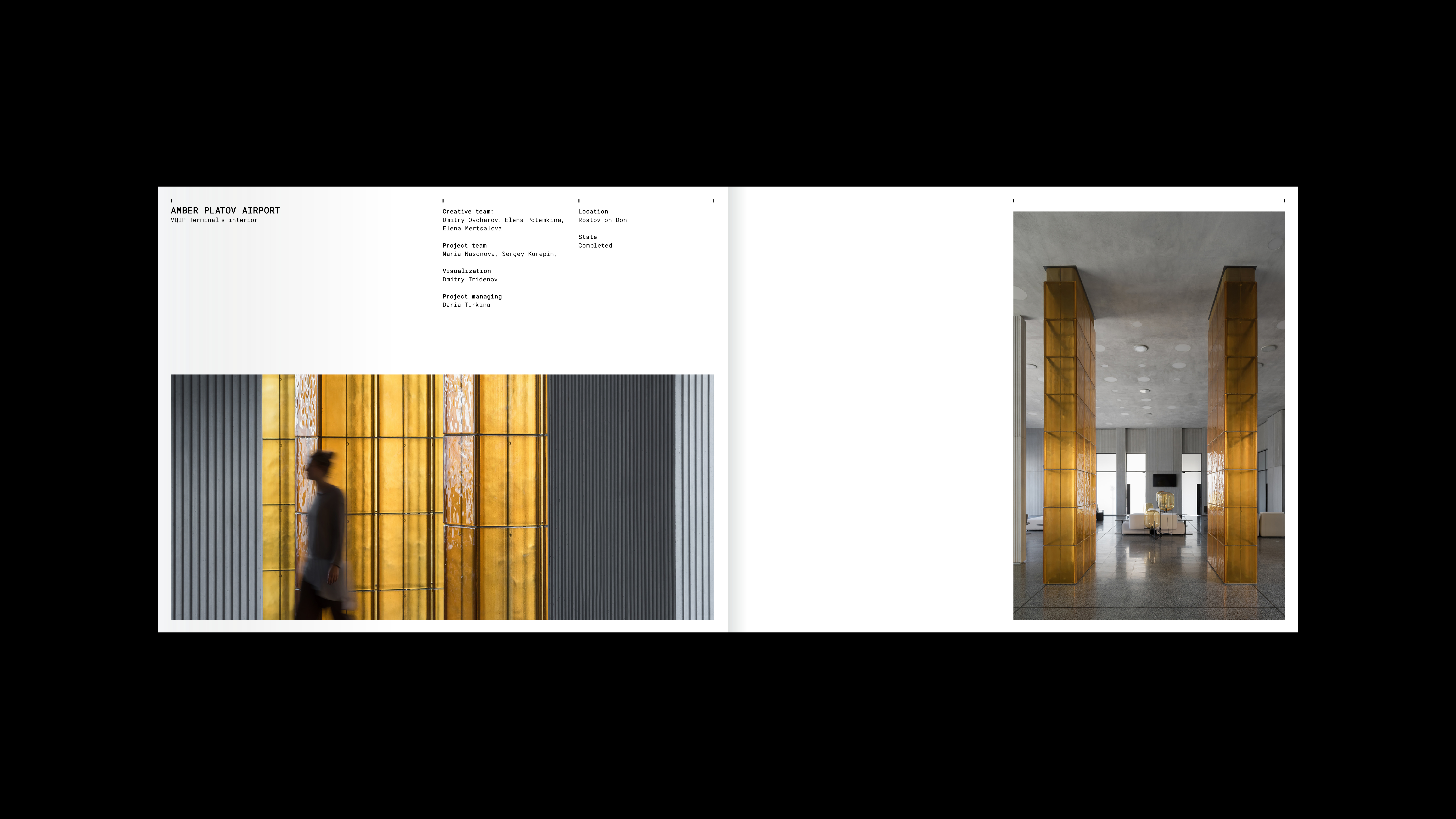
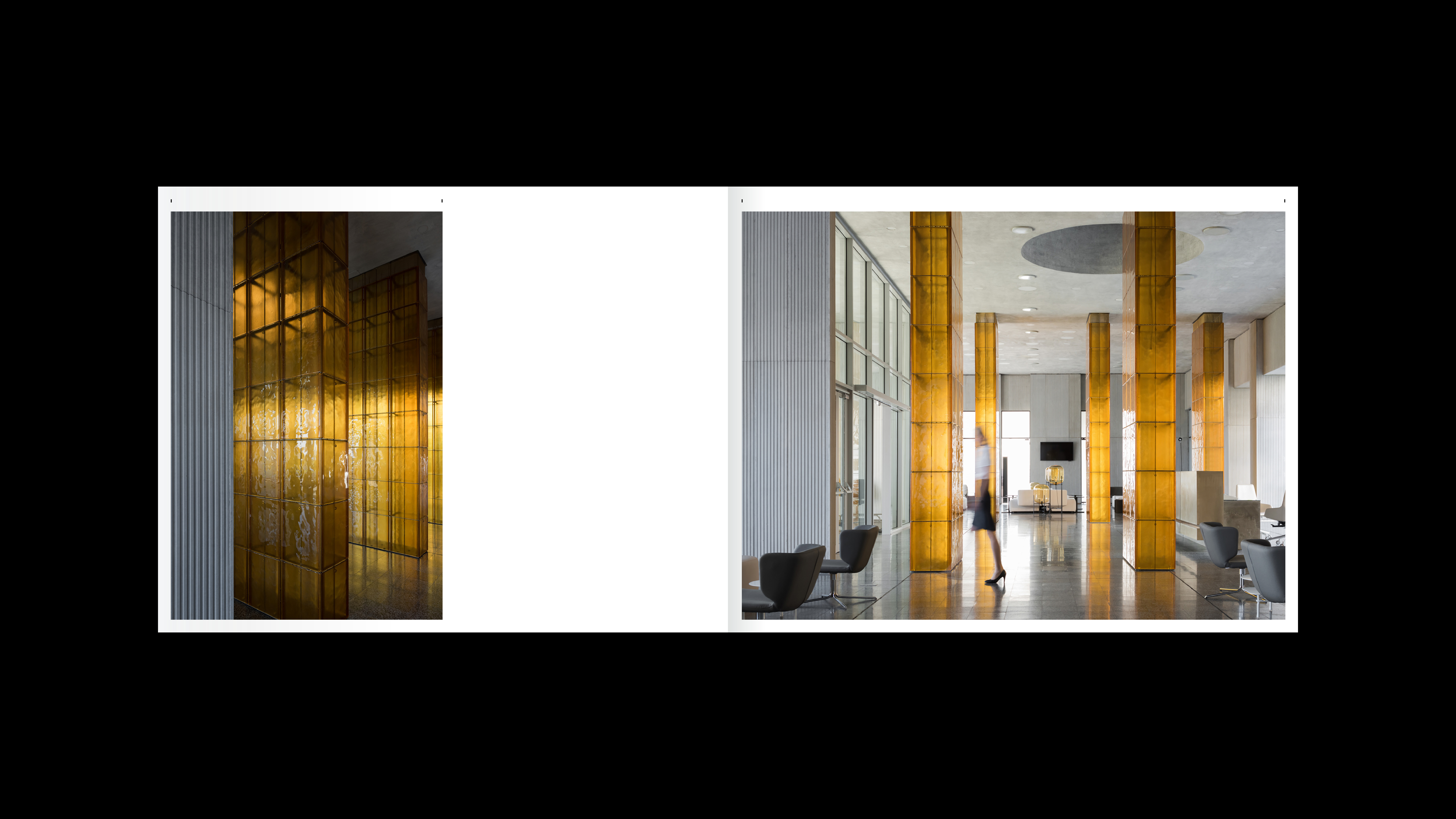
Nefa architects bureau, based in Moscow, has received numerous international architecture awards. The creation of unique, one-of-a-kind facilities is the niche that Nefa architects have been occupying for the last quarter-century. The bureau’s buildings and interiors are versatile in function and scale, but still, all of them can be described as custom-made.
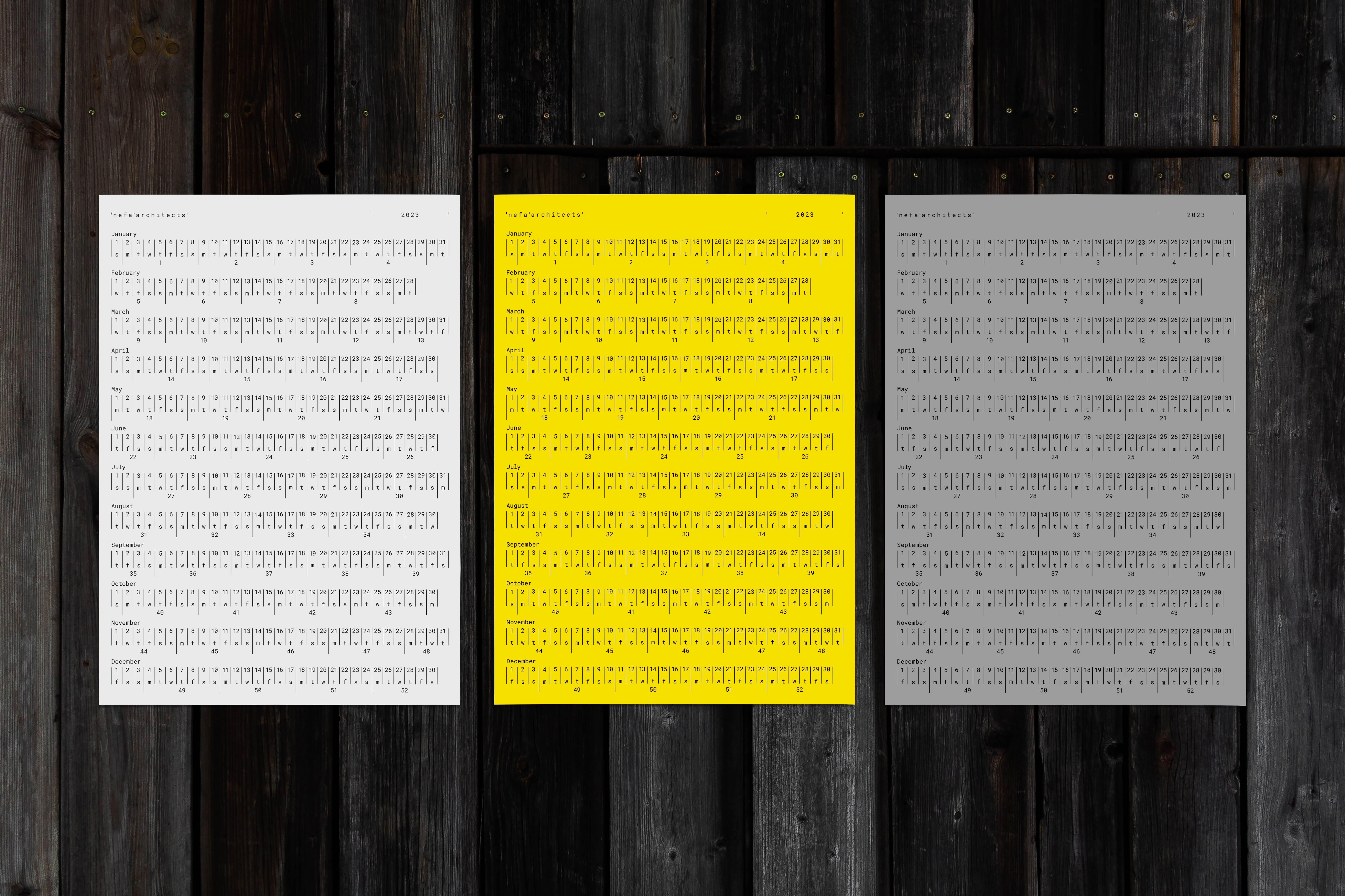
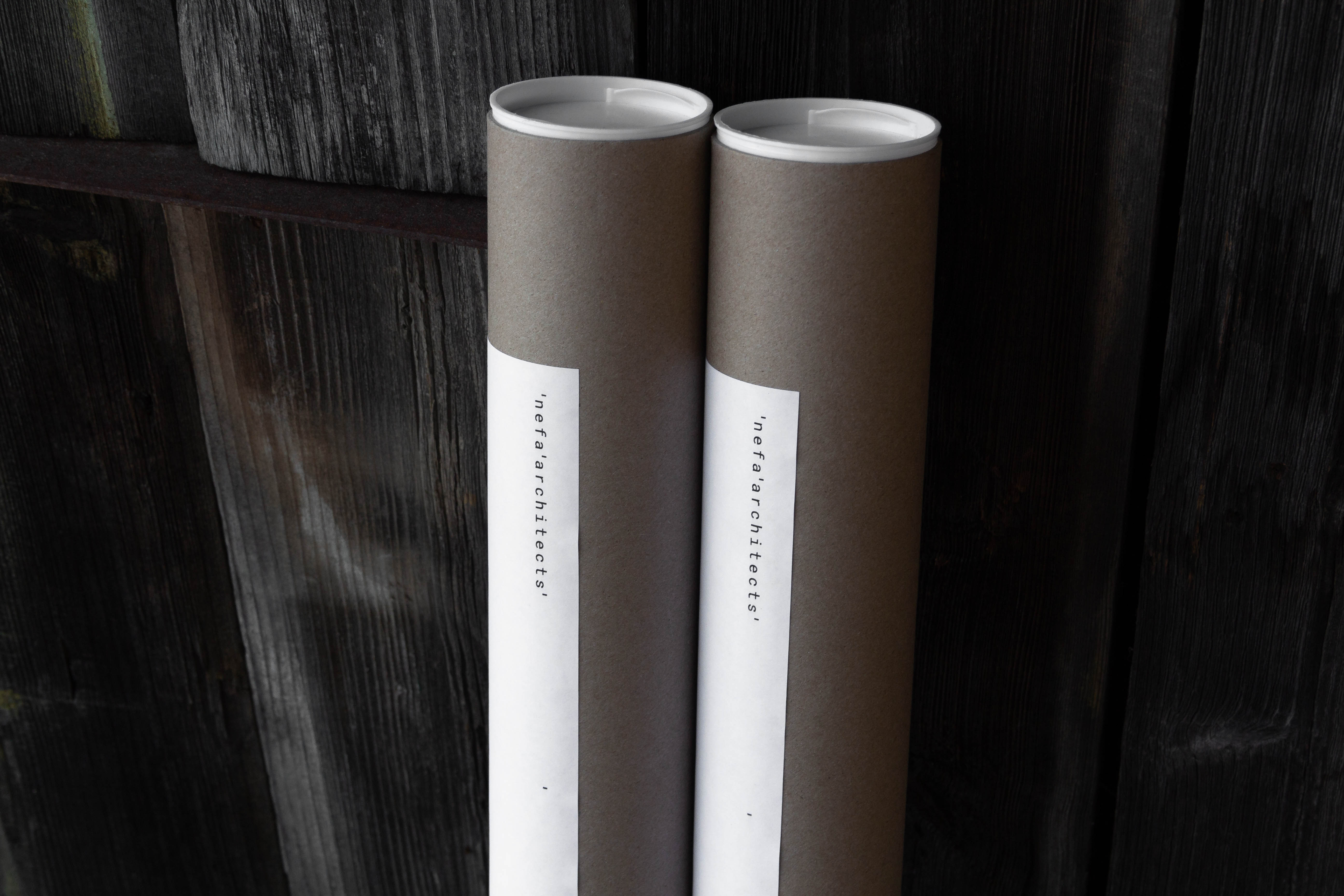
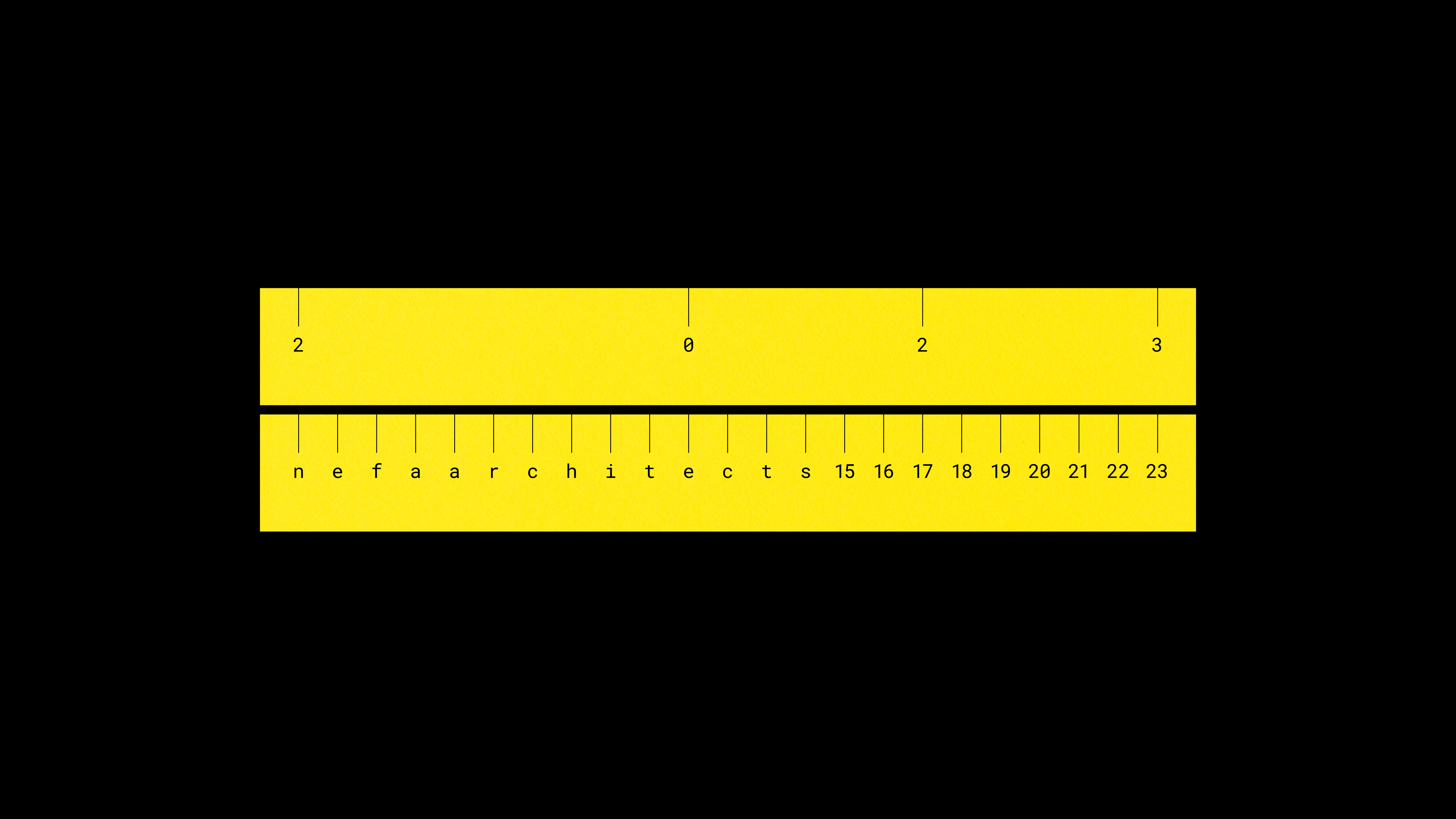
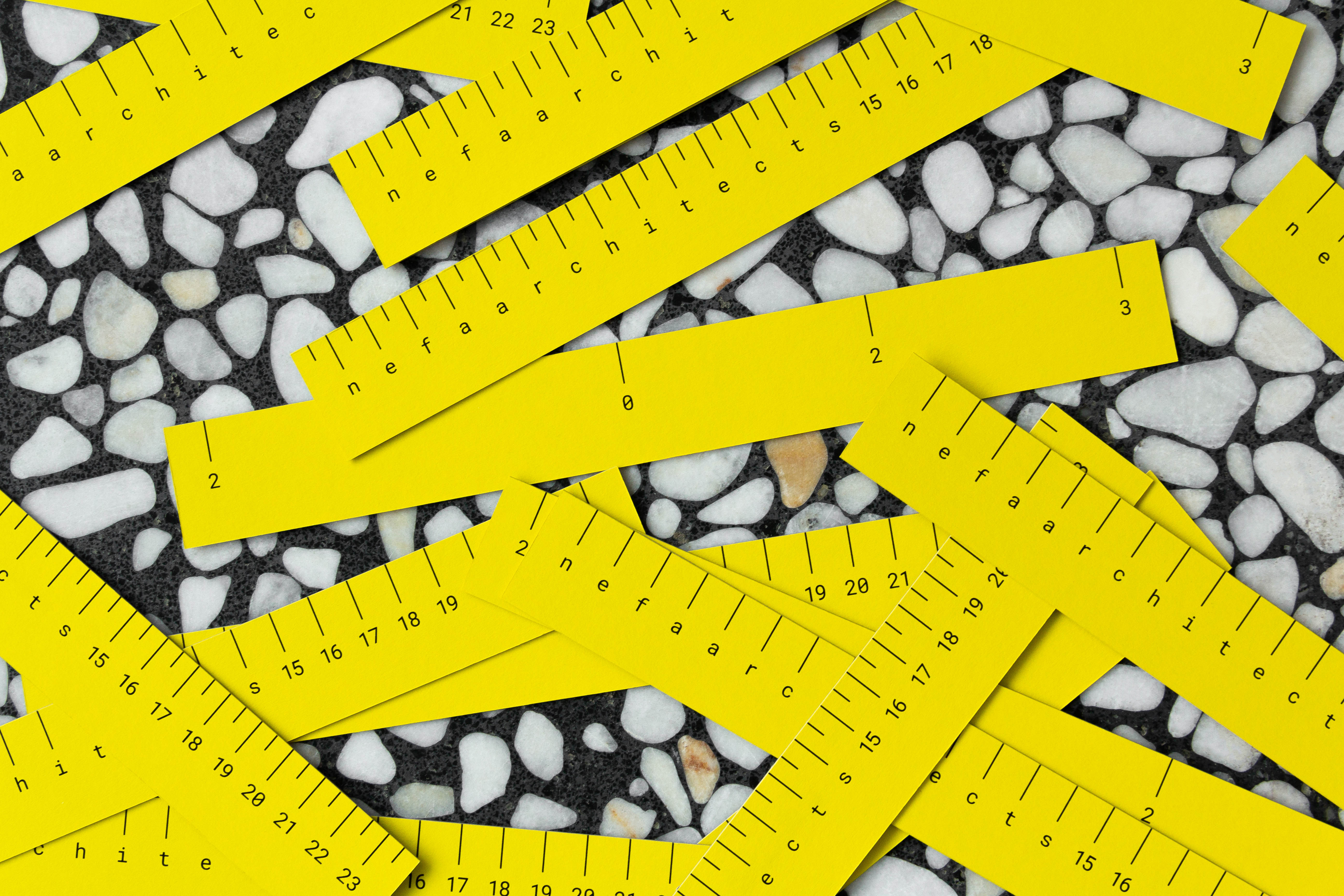
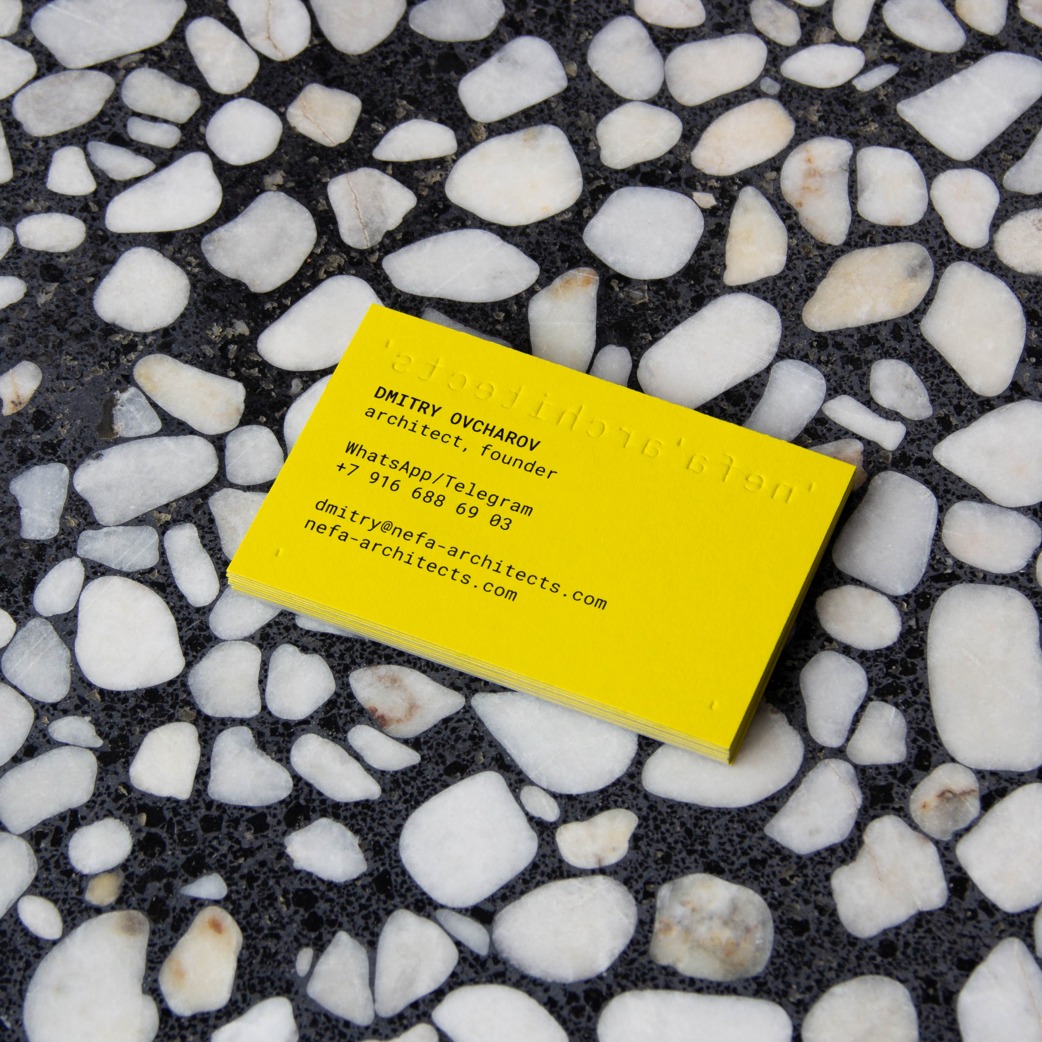
Our team was commissioned to redesign its logo, as well as its overall identity. We wanted to reflect the engineering approach to the design of spaces in the visual identity of the bureau. By incorporating the concept of measuring step, we use a monospaced font and ruler marks in the logo. The ruler marks form a modular grid according to which corporate materials are designed. For the palette, we selected colors from the projects that work well with the project images. The yellow color was chosen for an accent. We tried to create a restrained but at the same time unique visual identity.
Year: 2022
Client: Nefa architects
Scope: Identity concept & creation, Printed matter
