Linii
Linii
Linii
Brand Identity
Brand Identity
Brand Identity
About project
About project
Year
2024
Year
2024
Client
Linii.moscow
Client
Linii.moscow
Service
Brand Design
Creative Direction
Stationary
Website
Service
Brand Design
Creative Direction
Stationary
Website
Team
Daria Kazakova
Katya Nikolaeva
Maria Ovcharova (photo)
Team
Daria Kazakova
Katya Nikolaeva
Maria Ovcharova (photo)
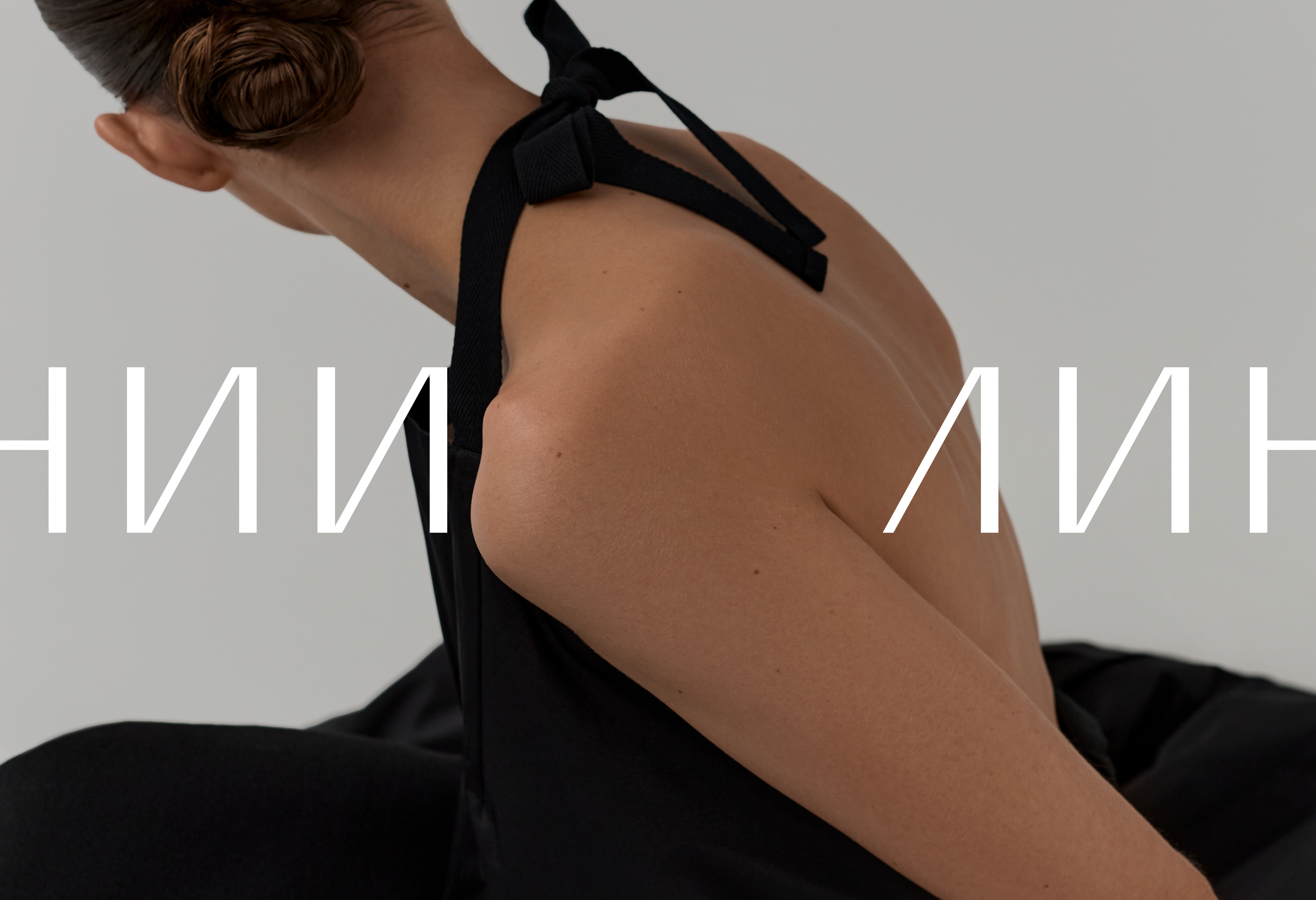

Linii is a women's fashion brand focused on basic and minimalistic clothing, where functionality and fabric quality prevail over trends.
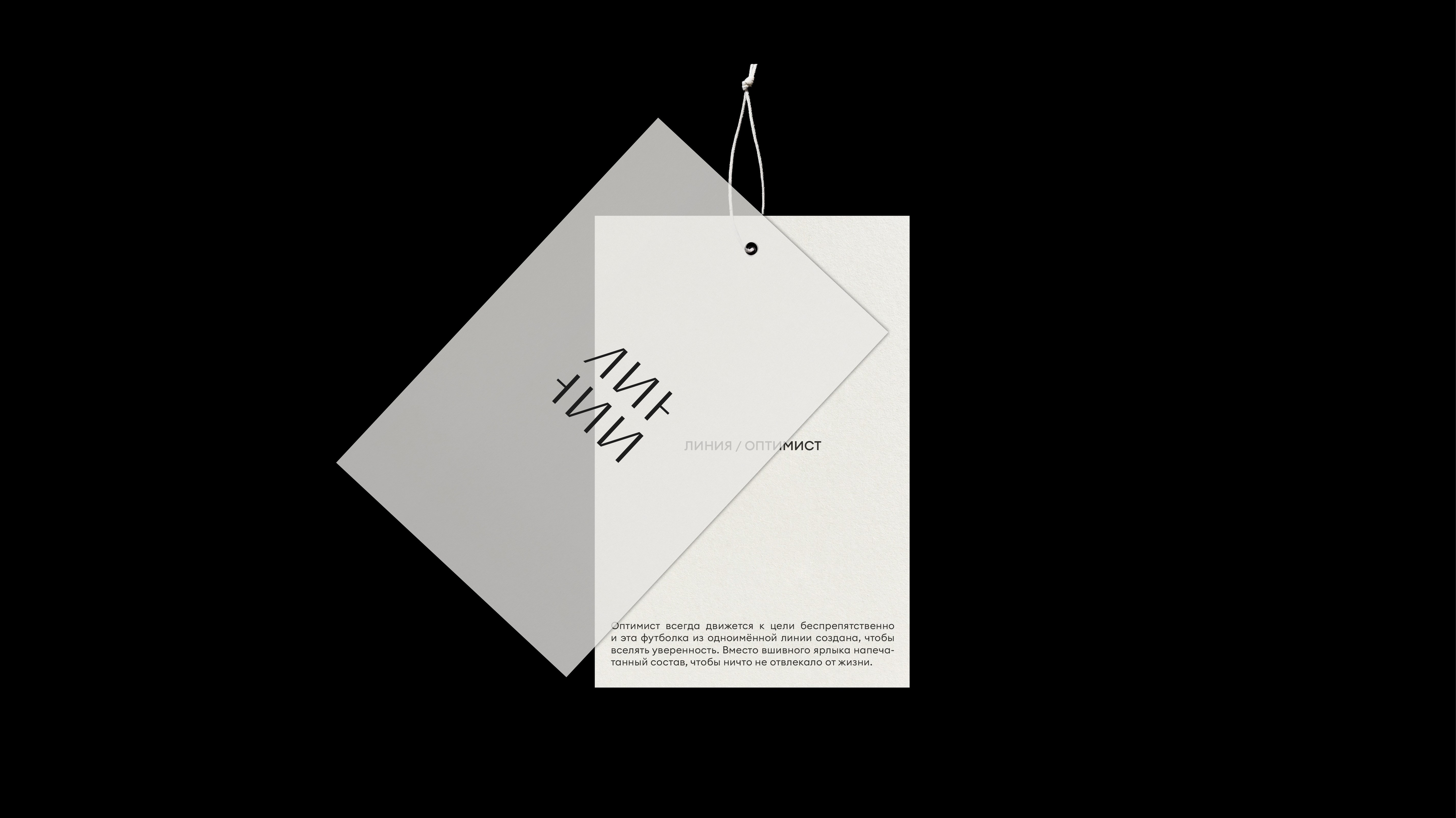
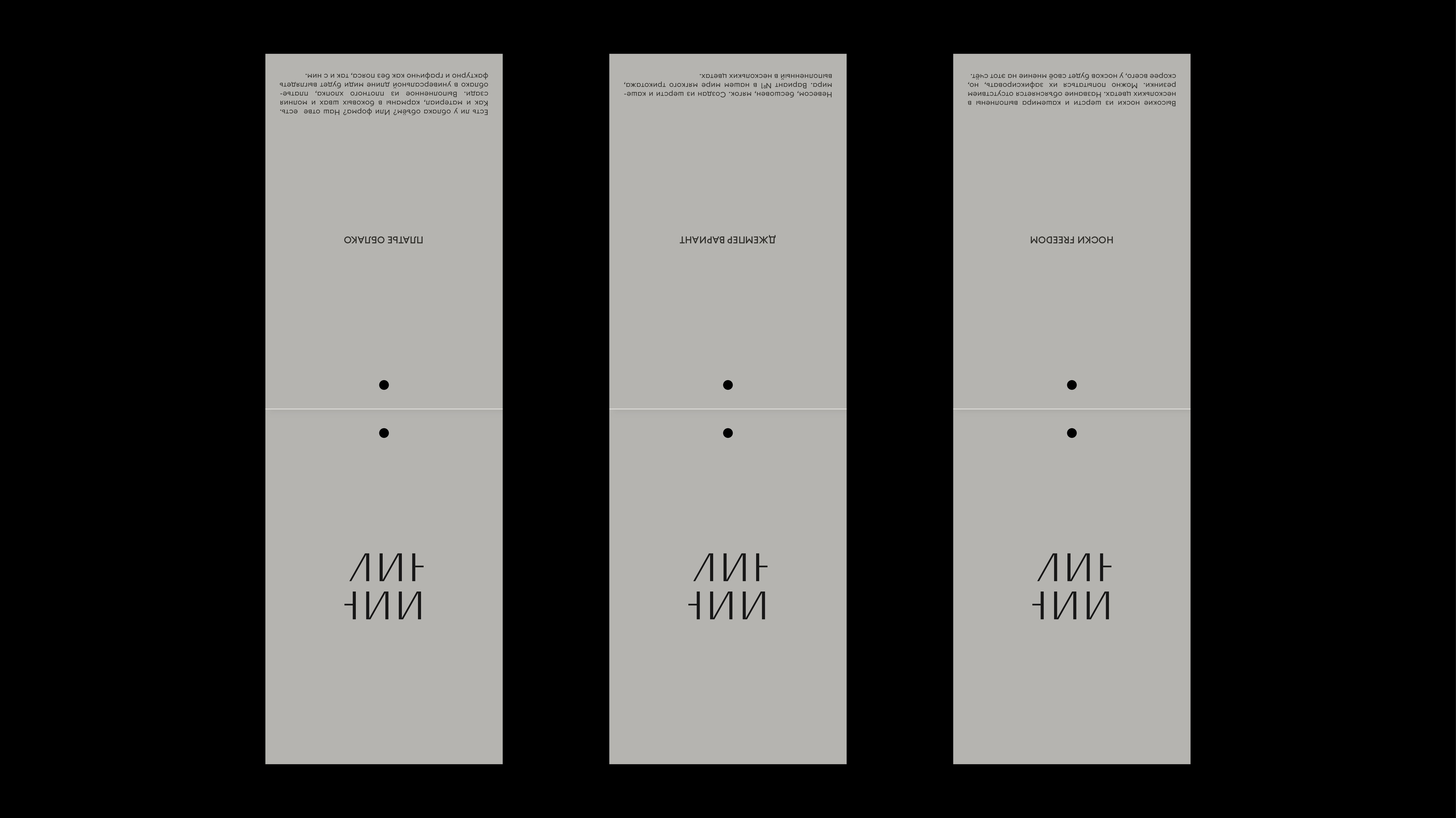
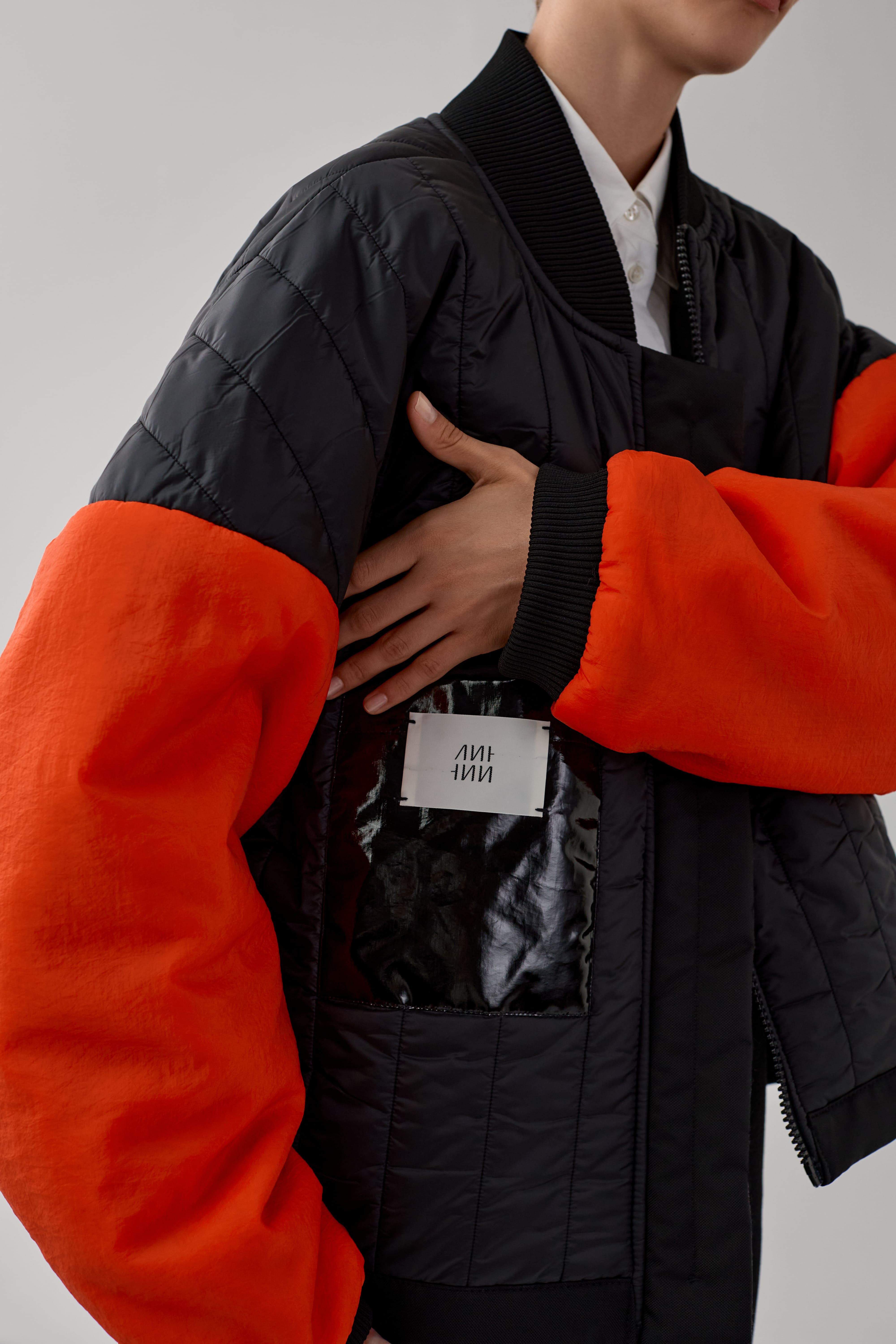
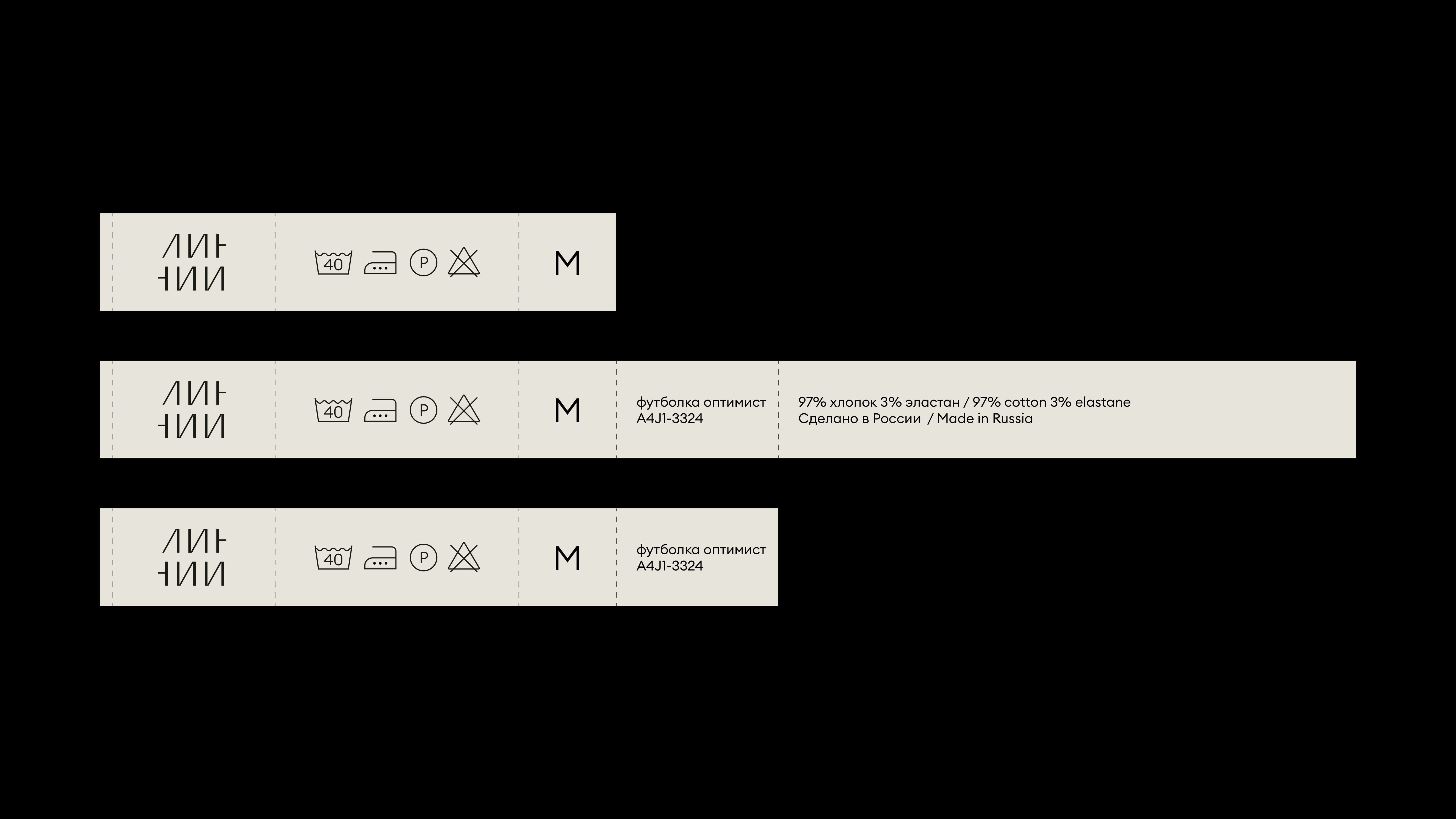
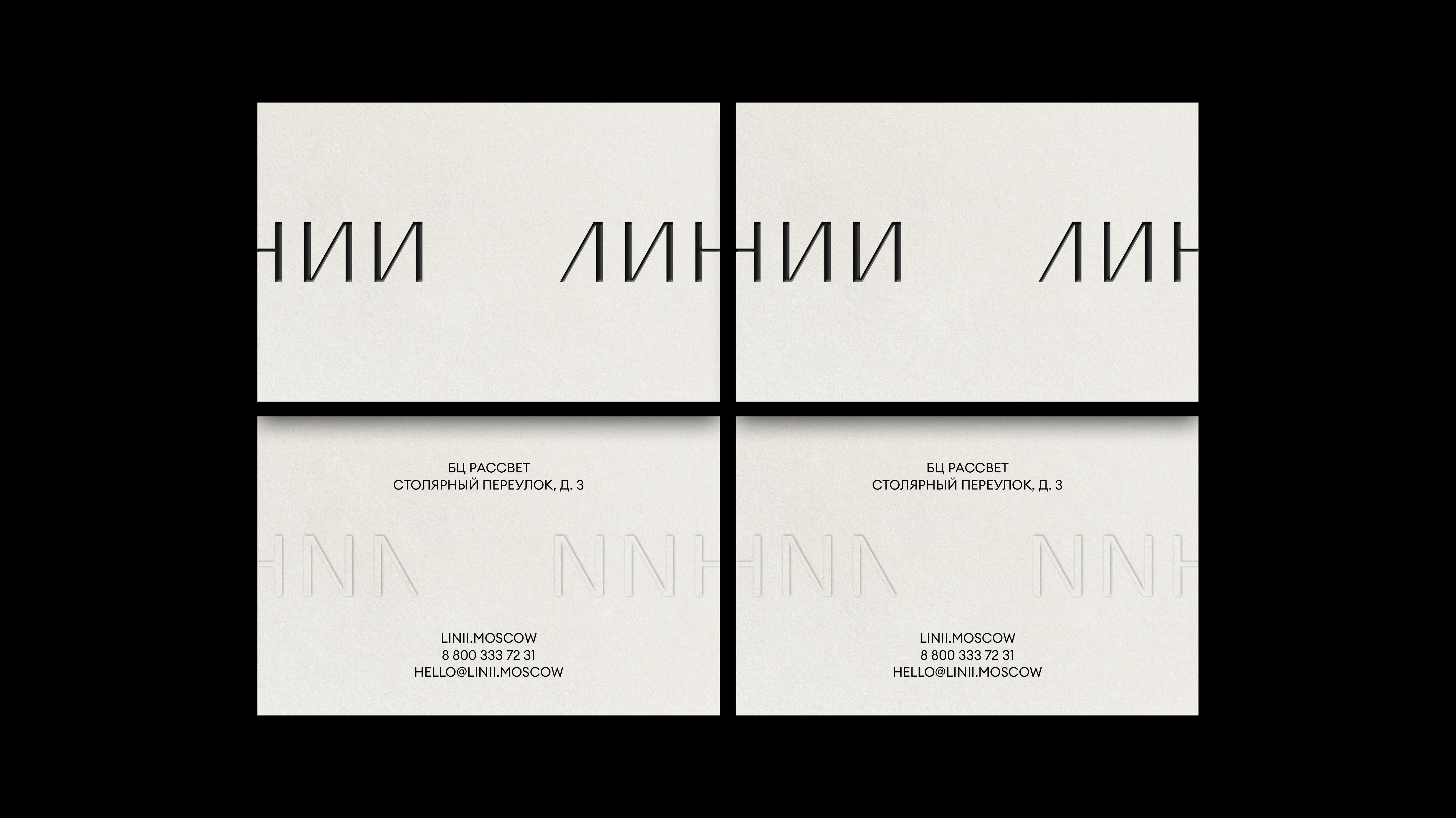
The brand name translates as “lines" from Russian and can be used in various contexts, such as clothing lines, graphic lines, stitch lines, and plot lines. The rhythm of the logo is set by alternating vertical and diagonal elements. There are two versions of the logo: assembled and in one ‘broken’ line. The brand identity is laconic and almost invisible. With a business idea based on minimalism, we wanted to focus on details, materials for labels, and transmit a simple and functional aesthetic into a digital experience.








Menu
Menu
About project
Year
2024
Client
Linii.moscow
Service
Brand Design
Creative Direction
Stationary
Website
Team
Daria Kazakova
Ekaterina Nikolaeva
Nikita Niziev
Maria Ovcharova (photo)
